Sunday, 16 December 2012

Chapter 4 Exercise 2 Higher and lower ISO


The objective of this exercise was to get us thinking about using different ISO settings and to consider when it would be appropriate to move away from the usual ISO100 setting. I remember as an 18 year old snapper being fascinated by the Kodak film adverts for different ISO films  and thinking it would liberate me from those dreaded flash guns... ISO 400 was, alas, not enough to avoid flash in night photography! I did however, stumble across ISO1600 in 1994 in Italy and took some amazing shots in the Sistine chapel. These were taken without flash and it was absolutely amazing when I saw them once they had been developed. I also learnt that taking photos outside with such an high ISO led to very grainy pictures lacking in contrast. Here are some of the pictures.


The night photo along with the photos from the Sistine chapel allowed me to take the photos hand held without the use of flash and because thee was no sunlight, the grain usually associated with fast film was almost imperceptible. The daylight photo atop the Cupola tells a different story... it appears washed out, faded and the grain is very evident. Obviously not an ideal combination! Fast forward almost 20 years and we now have high ISO settings at the flick of a switch on our cameras. What hasn't changed though is that the higher the ISO setting, the more you have to compromise in terms of picture quality as image noise is introduced into the image.

For this exercise I took approximately 36 images at different settings (I am only loading a third of them). I decided to use a still life subject  and increase ISO and aperture but maintain the shutter value constant at 1 second. I wanted to use different aperture settings to accentuate depth of field and of course the narrower the aperture, the longer the shutter would have to stay open. By increasing ISO and aperture values  you can gauge how the three values interact and the compromises you have to make depending on what you are trying to achieve. For instance a narrow aperture at say f/11 or f/16 will give the greatest depth of field and maintain sharpness into the photo... but a small aperture also means longer shutter speeds (or higher ISO values) each bringing their own difficulties... long shutter speeds make it impossible to shoot hand held. A tripod is the order of the day. High ISO  however creates noise... which is not quite as romantic as film grain.. in fact colour noise is probably the single most frustrating aspect of a photograph which usually ends up confining the photograph to the "cutting floor".
 
f/4.0: This is a fairly wide aperture setting and as such creates a shallow depth of field. The photos are all focused on the nutmeg and in the f/4.0 sets focus sharpness has already softened by the first orange half and by the second the image is sufficiently blurred to not be able to make out the segments within the orange. You will notice that image noise is very well controlled  even if you view an enlarged section of the wine bottle. As the aperture is wide and the image is well exposed at ISO 100 there is no need to increase ISO to brighten the image. As you can see an increase in ISO by up to 4 stops only brightens the image and even if you only increase the ISO to 200 the image becomes overexposed. In order to maintain the same depth of field I would have to decrease the length of time that the shutter stay open. As ISO is increased progressively by 4 stops, to maintain the same exposure level at this depth of field with increasing ISO settings I would have to decrease the opening times of the shutters from 1 second by a stop for every full stop increase in ISO, i.e. ISO 200 would only need a 0.5 sec shutter speed; ISO 400 would only need 0.25 sec shutter speed; ISO 800 would need 0.125 and  ISO 1600 would need a maximum shutter speed of 0.06 second or 1/10


ISO 100; Shutter speed 1". This photo is well exposed.

ISO 200; Shutter speed 1"
 
 
ISO 800; Shutter speed 1"
 
 
ISO 1600; shutter speed 1"


f/11: Aperture settings between f/11 and f/16 are considered the best aperture width for full frame cameras and which point they will capture the greater field of depth within an image before diffraction starts to soften image sharpness and so I decided to use these settings for the still life. In contrast to f/4.0 you will see that f/11 the depth of the focus now included the nutmeg, the  first half orange and the cinnamon stick. The wine bottle and the steel ring however, are not sharply in focus but they are certainly clearer than at f/4.0.  You will also notice that due the decreased size of the aperture letting less light in the image at ISO 100 is very dark. So dark in fact that the gold writing on the bottle cannot be made out so while the image has  a greater depth of sharpness and no discernible image noise it is far too dark and underexposed.  The right exposure only being achieved at about ISO 800 and by which point image noise has started to creep into the image in the form of colour noise that can be seen in the darker shades of the photo like the wine bottle.  The noise is still well controlled but is the black is no longer pure. This noise differs from the noise of fast image film noise which is more of a grain and can add a pleasing effect. This noise however does not have the same effect.


ISO 100; Shutter speed 1"


ISO 200; Shutter speed 1"


ISO 400; Shutter speed 1"

ISO 1600; Shutter speed 1"


f/16: The best  aperture setting for details and depth of sharpness should be a landscape photographers default "go to" setting, certainly if they are using a standard 35mm equivalent DSLR.  But unless you are taking the photo in bright conditions ISO 100 with it's guaranteed of no image noise is useless. The photographs below are yet again staged at progressively higher ISO settings maintaining aperture and shutter values constant. Realistically, the only image that is usable in the set below is the one at ISO 1600 and again, this is far too high an ISO to realistically produce noise free images. Depth of field, however, is phenomenal. Most of the photo has been captured with maximum sharpness and while the noise is well contained, it is still visible in the blacks and detracts from the image.  


ISO 100; Shutter speed 1"

ISO 200; Shutter speed 1"


ISO 400; Shutter speed 1"

ISO 800; Shutter speed 1"

ISO 1600; Shutter speed 1"

Conclusion
Ensuring an image is  well exposed and not unnecessarily distracting the ideal ISO setting to use would be a low ISO setting and a narrow aperture in instances where you want a sharpness throughout the image. This combination, however makes it difficult to take hand held photographs without rendering images useless on the grounds of a lack of sharpness caused by camera shake. Unless you are able to use a tripod the only way around this is to alter the ISO and aperture setting so that hand held shots are taken at a speed fast enough to overcome camera shake. If, on the other hand you wanted to isolate a subject and maintain only the subject in focus then you would aim for a wide aperture and as low an ISO as possible. This combination would facilitate using lower ISO settings because the wider aperture would allow more light to reach the sensor.

Whatever the settings, there arecompromises that you would have to consider and accommodate to the environment that you are photographing in. For instance, if the subject is sporting related and require a fast shutter speed above depth of field you would have to widen the aperture, thereby reducing depth of field and but increasing the amount of light that reaches the sensor and thereby ensuring that the photo remains bright. For a lot of sporting and wildlife photographs a shallow depth of field is ideal in that it will isolate the subject very effectively so this may not be too bad a compromise, whereas increasing ISO will introduce noise to a photograph which will detract rather than enhance the image. What then the lot of  the landscape photographer? A steady hand or a tripod would probably be the best option. If the ultimate goal is to maximise depth of field then aperture needs to remain narrow and ISO should not be taken beyond a setting of 400, possibly 800.


Wednesday, 28 November 2012

Chapter 4: Light

Exercise 1
 
I've uploaded a few bracketed photos along with their final high dynamic range or HDR image to illustrate the difficulties cameras have with dynamic range. the HDR is courtesy of Photoshop as I'e lost my photomatix key.. I have to say Photoshop has come a long way in this regard . Somewhat more realistic and it gives you more 'useable' control over how to manipulate the image... less gaudiness, so to speak. For whatever reason HDR remains an emotive issue. However I do believe it has a place in photography and I suspect that over the coming years the debate will settle down and much like the debate over whether colour photographs could ever be considered art now seems a non sequitor, so too HDR will take it's place in photography as a legitimate processing tool in photo production.
 
The first photo is in the courtyard at the British Museum. this is a composite of 7 exposures (I took one photograph in RAW format and then created 7 DNG images in Photoshop ranging from -3EV to +3EV and combined the 7 images using the Automate function in Photoshop. technically not a bracketing exercise but with similar results. the resulting image has captured the full range of details but this shortcut method is not without pitfalls: because the images combined are artificially created by exploiting the EV tool in Adobe Camera Raw, digital noise can be problematic and this can be seen in the shadows of the windows in the central building. I suspect that if I had contained the process to a maximum of 3or 4 images closer in EV say -1, 0, 1 and 2EV  the total difference in range between them would not have picked up on the noise but it is nevertheless a god example of what can be achieved by combining a number of image of different exposure values.


The next set of photographs  were taken in Girona in the Cathedral. I used a tripod and took 3 separate photographs using my camera's bracketed exposure function. the images were then combined in Photoshop to produce the top image.  You will see that despite the high ISO, digital noise is well contained and the final image produces a pleasing mixture of lights and darks across a broad range of light. looking at the actual photographs that were taken in situ none of the 3 could be said to provide an accurate reflection of the detail in subject matter. The photograph containing details in the shadows has blown highlights... this is easily seen the histogram where the graph is skewed to the right. the opposite can be said for photograph containing details in the highlights (the dark photograph). That photograph has virtually no detail in the shadows. but the highlights are well defined and not blown. The histogram for that photograph was skewed to the left showing a loss of details in the shadows. The photograph in the middle, whilst capturing a good range of detail, somehow feels flat and still suffers from clipped highlights- the same can not be said of the combined photograph though.. it really does feel like you are there, taking in all the details of the scene.


HDR Composite of chapel in the Cathedral of Girona, Spain 


f5.6; Shutter 1/13; ISO 3200 EV:-2


f5.6; Shutter 0.3sec, ISO 3200 EV 0


f5.6; Shutter 1.6 sec ISO 3200 EV +2

Tuesday, 18 September 2012

Assignment 3: Colour

So after getting very excited about my next assignment and how I would base it around Origami, I return with a completely different subject matter. The problem with the Origami figures was that you really need to have a deft hand and producing them properly..ragged edges are just not very impressive to look at.

I had to go back to the drawing board and come up with a new idea. I drew on my archives of photographs looking for the colour themes, and I found plenty!

Complementary Colours:
Blue and Orange:

Pink and  Lime:

Yellow and Violet:

Red and Green:


Similar Colours
Yellow and Orange:

Yellow and Green:
 
Cyan and Green:

Purple and Magenta:


Contrasts
Purple and Green:
Orange and Purple:
Yellow and Blue:
 

Orange and Green:
 

Colour Accents

Blue and Red:

Purple and Green:

 
Blue and Orange:
Orange and Yellow:

Sunday, 2 September 2012

Asignment 3: Colour


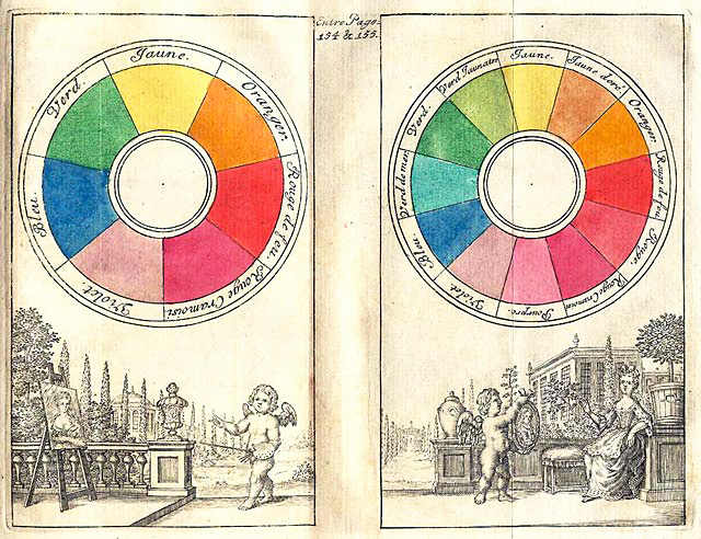
File:Boutet 1708 color circles.jpg


 Color Wheel
The colours of light.


I have copied 2 images from the web on colour wheels. the first is a quaint early 18th Century picture showing that even then we were interested in understanding the way colours work. As this is a photography course and in particular, a course reliant on digital media (certainly for those of us using digital cameras and Photoshop) I have opted to rely on a colour of light wheel although the concept of colour contrasts and harmonies relates to our perception of colour which transcends the actual medium. It is beyond the scope of this assignment to go into a theoretical discussion analysing how colours interact.
 
The assignment brief asks us to show a command of colour in photography by making use of the visual medium, photography. We have to explore colour relations through the harmony of complementary colours, similar colours and colour contrasts. We're also asked to explore colour accents through any of these relationships. To keep things simple (ha ha) I've decided to continue my approach of having themed assignments and this one will look at these relationships thru' photos of origami! So I'm off to build animal shapes of paper to photograph them for the assignment... see you in a bit. Ta-ta for now.

A year on

So it's been a year since I last looked at my course. I was bullied in my last job, had counselling for that and the resultant depression and spent many hours hating my photography and everything else I hold dear. There have been many times in the last year that I resolved to give up on the course. "Who was I kidding?" "Me? A photographer?" "Really?"

Moments of extreme  self-doubt and loathing.

I changed jobs and slowly the anger abated and I started to see light at the end of the tunnel. I started running and started enjoying life again. And still the course loomed on the horizon... a massive cloud waiting to prove once and for all that I am no photographer. A mediocre snapper at best. It's a terrible having to admit that. I love taking pictures, but the end result is never really memorable and certainly not anything I would rate as anything more than a pretty picture.

So what now? do I carry on with this course? Do I cut my losses and abandon it after 2 assignments?
I've decided that I will carry on. If only to see it through and learn what I had always thought should be innate and instinctual to a photographer.

I'm back!


Thursday, 1 September 2011

feedback on assignment 2 and amendments

I have received feedback on my second assignment and am including the feedback along with the original assignment in this blog. As part of the feedback it was suggested that I include the original un-manipulated images as the processing of the photo's to mimic Infrared has concealed detail making it difficult to assess whether there are any technical issues which I have to address. 

In order for everything to make sense I have included the assignment along with  provide my tutor's feedback with the images submitted for the assignment and the original images in black and white but without the infrared processing.


The Art of Photography
Assignment 2: Elements of Design

This assignment focused on graphic elements within a photograph. To accentuate this I decided to, as suggested in the introductory paragraph of the chapter, remove colour from the equation. I did not want to just present a series of monochromatic prints but rather I wanted to use this assignment as an opportunity to try and convey a message, through the specific effects.

We were given a choice of subjects with the restriction that all the photographs are of the same subject matter. I settled on exploring my own subject, Sicily, taking predominantly landscape / architectural types of photographs with the aim of challenging the viewer to see beyond the obvious subject matter.

The aim was to draw on the inherent conflicts within Sicily, a land weighted by an ancient heritage and tradition and yet brimming with modern ideals. This conflict is not immediately apparent on the surface but that message is obvious once one looks beyond the holiday destination to the ingredients within the infrastructure: past, present and looking to the future. I eventually settled on an infrared effect.  I do not have an infrared camera so I mimicked the effect in Photoshop (although I did not use the specific infrared filter in Photoshop but rather used  various techniques to mimic the effect).  I settled on this effect because infrared photography accentuates different tones and highlights in the subject and in turn demands that the message be looked at in a different way too.

The brief was to produce a series of at least 10 photographs
  1.     Single point dominating the composition
  2.    Two points
  3.   Several points in a deliberate shape
  4.  A composition of vertical and horizontal lines
  5. Diagonals
  6. Curves
  7. Distinct even if irregular shapes
  8. At least two implied triangles
  9. Rhythm
  10. Pattern


Single point dominating the composition
original picture
Submitted picture


The temple at Segesta
Aperture: f4
Shutter speed: 1/640
ISO: 100
Focal length: 67mm on a full frame sensor

Tutor's comments: "Good, if not very original, arrangement of shapes. Parts of the field appear out of focus, is that something to do with the infra red effect?"

My reply:  Agreed that it was not a very original composition and that's why I tried to balance the static composition of the temple by framing the landscape to create movement within the picture. The whole aim of this project was to draw the viewer's attention away from the obvious to find the tensions surrounding Sicily within the pictures. The message I want to convey in this picture is that despite longstanding traditions and customs (the temple) which are static and unwavering, life in Sicily is full of movement and energy. As far as the softness is concerned, part of that is because of the infrared effect, I used Gaussian blur and added noise in photoshop, but looking at the standard B&W photo I can See that it is still quite soft. I think in part it's because I was using a zoom lens and took the shot from quite a distance away, focusing solely on the temple. The aperture was wide open and that in of itself was always going to produce a soft foreground.


Two points


Archaeological ruins at Segesta
Aperture: f18
Shutter speed: 1/100
ISO: 800
Focal length: 80 mm on a 1.6x crop sensor (effective focal length: 128mm)

Tutor's comments: "The two columns are well placed but everything is a bit middle distance, some foreground interest would make a difference".

My reply: oh dear, looks like I failed miserably on this one. The two points I was focusing on were the ruins and the burning bush. With the bush being partly framed by the ruins. Whereas I think my tutor has interpreted the shot as the two walls of the ruined house as being the two points.In other words the dynamic of this shot was for the eye to be led to the bush via the ruined structure. Again working on the theme that ultimately  while static and unwavering traditions survive, what thrives and prospers is adaptability and resourcefulness.  Despite the lack of success, this is still my favourite shot of the series. I look at it and glows with force. 


Several points in a deliberate shape 


Vineyard and windmills, Provincia di Agrigento

Aperture: f11
Shutter speed: 1/400
ISO: 400
Focal length: 260 mm on a 1.6x crop sensor (effective focal length: 416 mm)

Tutor's comments: "This has got some foreground interest and a lot of foreshortening which gives it an almost abstract, flat look. The sky and windmills are all a bit grey compared to the foreground, as though from a different picture, it might be worth increasing the contrast in the sky area."

My reply:
Agreed but I would add that this is not a composite picture but a single exposure. It was taken from a distance so the zoom has flattened the image.

A combination of vertical and horizontal lines


The temple at Segesta
Aperture: f5
Shutter speed: 1/125
ISO: 100
Focal length: 70 mm on a 1.6x crop sensor (effective focal length: 112mm)

Tutor's comments: "This is interesting. It is divided up well, plenty of depth and everything in focus. Nicely lit."


My reply: This shot clearly demonstrates the different highlights that an infra red photograph brings out in a picture with the original photograph feeling quite flat by comparison. I think this photo really does encourage the viewer to look at a fairly quaint scene and see it in a different way. a sort of "secret garden" right before your eyes.

Diagonals


Capturing the sun (a study of solar panels), Provincia di Agrigento
Aperture: f10
Shutter speed: 1/30
ISO: 100
Focal length: 70 mm on a 1.6x crop sensor (effective focal length: 112mm)
 
Tutor's Comments: "A very interesting composition, again almost abstract and very well balanced and the curvy road leading the eye in to the diagonals."

My reply: Thank you. I framed it so that the general landscape flowed in the same way as the solar panels.Interestingly after reviewing the photoshop on my pc I noticed the individual rows of panels themselves create  perpendicular  diagonals to the upward slant of the panels as a whole. 


Curves


A29, Trapani
Aperture: f16
Shutter speed: 1/125
ISO: 500
Focal length: 115 mm on a 1.6x crop sensor (effective focal length-184mm)

Tutor's Comments: "Marvellous! An excellent composition. The only slight quibble I would have is that if you had tilted the camera down a little bit the road would have started from the corner of the frame which I think would have been better."


My reply: Thank you!


Distinct, even if irregular, shapes


Criss-Cross, cross my heart
Aperture: f16
Shutter speed: 1/125
ISO: 500
Focal length: 115 mm on a 1.6x crop sensor (effective focal length-184mm)

Tutor's comments: "Another good composition, they are not really irregular though they are fairly regular triangles. I like the little tangle of grass at the front."

My reply: I interpreted the instruction Distinct shapes, even if they are irregular, i.e. they did not have to be irregular. point taken though. Post processing this shot momentarily competed with the pillars for rhythm but I decided that it should remain as my example of distinct shapes.


At least two kinds of implied triangle


Untitled
Aperture: f9
Shutter speed: 1/80
ISO: 100
Focal length: 45mm on a full frame sensor
Tutor's comments: "I like the symmetry and the steps coming down and the figure and the textures. The picture is a bit unresolved at the bottom with his legs being chopped off like that and the ground bleeding off into the border."

My reply: I framed this shot to include implied triangles on the steps (3) as well as the photographer (2) including the negative space between his legs. I think the non IR version works better.


Pattern


Quilt
Aperture: f11
Shutter speed: 1/25
ISO: 100
Focal length: 300 mm on a 1.6x crop sensor (effective focal length-480 mm)

Tutor's comments: "The long lens helps with the foreshortening to flatten everything and make it into a pattern."


My reply: Not sure I completely understand this feedback. I took the photograph because the arrangement of the field looked like quilt to me.  I had wrestled with myself as to which photo I would use because I had taken a few including the following:

Ultimately it was a subjective choice but I felt that of these  photographs, the field fitted in and was more in keeping with, the general theme of the work.


Rhythm


Waves
Aperture: f5
Shutter speed: 1/160
ISO: 100
Focal length: 70 mm on a 1.6x crop sensor (effective focal length-112mm)


Tutor's comments: "Very good sense of rhythm. I think a bit more contrast would help, it looks a bit grey."

My reply: Hopefully the unaltered image addresses the contrast and softness issues. again I would stress that film IR photographs tend to be soft and grainy taking away that punchy sort of feel you get with digital photography  and which I am quite bored with at the moment.