Rounded/Diagonal
Rounded
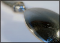
The shapes are good and the arrangement in the rectangle is good but you can’t have complete black with no detail or texture in a photograph, it’s like looking into a black hole.
Diagonal
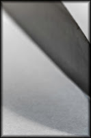
Well it is a diagonal but you can’t generally get away with pure abstracts in photography, people tend to want to know what it is, perhaps if you had it in focus and a glint of light on the edge of the blade it might work better.
Few/Many
Few
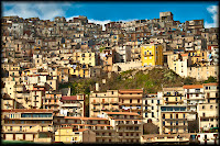
Good clouds, good hills. If you had got down a bit lower you could have made more of the grasses in the foreground and got rid of those wires.
Many
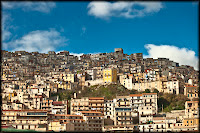
Good idea. I think I might have had a little less sky, made the top of the buildings about a third down because the patterns and rhythm of the buildings is so interesting and strong.
High/Low
High
Interesting that you have not done a literal description of “high”. Good and skillful use of selective focusing.
Low
Same as above, good depth of field (from now on d.o.f.)
Hard/Soft
Hard
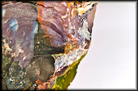
Yes, that’s hard and some interesting colours and shapes, in fact the colours and shapes are so interesting I would have less of the blank part on the right.
Soft
Good exposure and the arrangement of shapes works well.
Liquid/Solid
Liquid
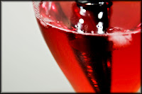
Good shapes and colours but I can’t see any of it in focus, it all looks a bit out.
Solid
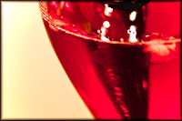
Even though it looks like liquid it is in fact solid.
Lots of energy in this one and a certain ambiguity.
Moving/Still
Moving
Good movement and a slashing diagonal for a bit of excitement.
Still
I don’t think that this really a photograph about stillness, it is a movement frozen by photography which is not the same thing.
Rough/Smooth
Rough
It is the right texture, well exposed and focussed but not very interesting as a picture, it needs something else in it.
Smooth
Quite interesting shapes but it needs something to give it scale and context, a fly maybe.
Dark/Light
Dark
Normally one would say that the figure in the picture was blurred and out of focus but I think this adds to the atmosphere. I think the flame needs to be less white, more colour and texture required in the flame.
Light
It is exciting but again the flame is over-exposed.
Dark and Light
Good colours, good shapes, a little figure in it would add a lot to make it interesting; scale, context, narrative content.


No comments:
Post a Comment