Wednesday, 25 May 2011
Sunday, 22 May 2011
Not part of the course, but I thought I'd try those magazine tutorials....
I seem to buy a lot of photography magazines, pouring over their photographs, reading articles pro's and what they are doing atm and invariably putting their tutorials to the side with the good intention of trying them out one day... no more. that day has come. So instead of working thru' the coursework this evening, I've decided to buckle down and give those tuts a go.. I'll even use their photographs!
First off was the supersampler... it's worked but because I decided to add a border to it it embossed the the dividing lines too. Not sure I'm that keen on the embossing effect!
 |
| start image |
 |
| Final image |
Next I tried an antiquing effect which I must say was quite time consuming and probably needs a bit more practice but, I think that overall it was a good result turning a modern crisp digital image into something a little more romantic and a little less hard on the eyes. I love it. I had tried different effects before using my own techniques but that left the images always looking a little washed out and indistinct. This is definitely a technique I will use again. So I'll set out the main points of how it was done but you can also find the tutorial in the May 2011 issue of Photoplus (Canon Edition) magazine:
- Create a border using layers and resizing the canvass to 110%
- Rough up the border again using the layers palette and selecting the brush tool (Hard Pastel on Canvas) setting size to about 60px- blur it using the Gaussian Blur effect
- Increase the contrast by creating a monochrome layer and using levels set white highlight to about 215 and black shadow slider to about 30
- Create diffuse highlights by setting the monochrome layer's blending mode to luminosity and setting opacity at around 40%
- Then desaturated the yellows to -55 from the image to give the photo a colder feel and then desaturate the master saturation down to about -35
- To create a light leakage effect (and i struggled a bit with this one) you create a new layer and selecting that layer with the background copy. using brush tool select the foreground colour to orange and paint over the edges bringing opacity down to about 57%
- finally use a vignetting effect to focus the attention n the boat.
Saturday, 21 May 2011
Assignment 1: Contrasts- feedback and adjustments
Feedback on assignment
Rounded/Diagonal
Rounded
The shapes are good and the arrangement in the rectangle is good but you can’t have complete black with no detail or texture in a photograph, it’s like looking into a black hole.
Diagonal
Well it is a diagonal but you can’t generally get away with pure abstracts in photography, people tend to want to know what it is, perhaps if you had it in focus and a glint of light on the edge of the blade it might work better.
Few/Many
Few
Good clouds, good hills. If you had got down a bit lower you could have made more of the grasses in the foreground and got rid of those wires.
Many
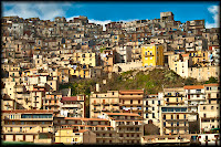
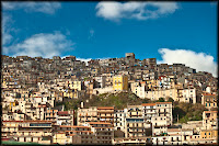
Good idea. I think I might have had a little less sky, made the top of the buildings about a third down because the patterns and rhythm of the buildings is so interesting and strong.
High/Low
High
Interesting that you have not done a literal description of “high”. Good and skillful use of selective focusing.
Low
Same as above, good depth of field (from now on d.o.f.)
Hard/Soft
Hard
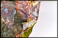
Yes, that’s hard and some interesting colours and shapes, in fact the colours and shapes are so interesting I would have less of the blank part on the right.
Soft
Good exposure and the arrangement of shapes works well.
Liquid/Solid
Liquid
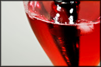
Good shapes and colours but I can’t see any of it in focus, it all looks a bit out.
Solid
Even though it looks like liquid it is in fact solid.
Lots of energy in this one and a certain ambiguity.
Moving/Still
Moving
Good movement and a slashing diagonal for a bit of excitement.
Still
I don’t think that this really a photograph about stillness, it is a movement frozen by photography which is not the same thing.
Rough/Smooth
Rough
It is the right texture, well exposed and focussed but not very interesting as a picture, it needs something else in it.
Smooth
Quite interesting shapes but it needs something to give it scale and context, a fly maybe.
Dark/Light
Dark
Normally one would say that the figure in the picture was blurred and out of focus but I think this adds to the atmosphere. I think the flame needs to be less white, more colour and texture required in the flame.
Light
It is exciting but again the flame is over-exposed.
Dark and Light
Good colours, good shapes, a little figure in it would add a lot to make it interesting; scale, context, narrative content.
Rounded/Diagonal
Rounded
The shapes are good and the arrangement in the rectangle is good but you can’t have complete black with no detail or texture in a photograph, it’s like looking into a black hole.

Diagonal
Well it is a diagonal but you can’t generally get away with pure abstracts in photography, people tend to want to know what it is, perhaps if you had it in focus and a glint of light on the edge of the blade it might work better.

Few/Many
Few
Good clouds, good hills. If you had got down a bit lower you could have made more of the grasses in the foreground and got rid of those wires.
Many
Good idea. I think I might have had a little less sky, made the top of the buildings about a third down because the patterns and rhythm of the buildings is so interesting and strong.


High/Low
High
Interesting that you have not done a literal description of “high”. Good and skillful use of selective focusing.
Low
Same as above, good depth of field (from now on d.o.f.)
Hard/Soft
Hard
Yes, that’s hard and some interesting colours and shapes, in fact the colours and shapes are so interesting I would have less of the blank part on the right.

Soft
Good exposure and the arrangement of shapes works well.
Liquid/Solid
Liquid
Good shapes and colours but I can’t see any of it in focus, it all looks a bit out.


Solid
Even though it looks like liquid it is in fact solid.
Lots of energy in this one and a certain ambiguity.
Moving/Still
Moving
Good movement and a slashing diagonal for a bit of excitement.
Still
I don’t think that this really a photograph about stillness, it is a movement frozen by photography which is not the same thing.
Rough/Smooth
Rough
It is the right texture, well exposed and focussed but not very interesting as a picture, it needs something else in it.
Smooth
Quite interesting shapes but it needs something to give it scale and context, a fly maybe.
Dark/Light
Dark
Normally one would say that the figure in the picture was blurred and out of focus but I think this adds to the atmosphere. I think the flame needs to be less white, more colour and texture required in the flame.
Light
It is exciting but again the flame is over-exposed.
Dark and Light
Good colours, good shapes, a little figure in it would add a lot to make it interesting; scale, context, narrative content.
Saturday, 14 May 2011
Assignment 1 (cont)
Argh! back to this assignment. I'm going to miss tomorrows deadline. don't understand what is blocking me but it's almost like sabotage!
I think I've been taking pictures thinking of this assignment and have have not got very far. I know that I have a whole bank of photographs that I could use but for some reason I'm not happy with most of them. it's all very frustrating.
Fstfwd a day: have spent most of the weekend doing something to do with this assignment. yeah me!After a lot of thinking and planning I decided that i would try my hand at macro photography (without a dedicated macro lens and only a couple of extension tubes).
without further ado, here are the photos for the assignment. Some of the metadata is incomplete as the macros were not taken with a dedicated macro lens but with extension tubes and all the settings were adjusted manually. the lens maximum aperture was f4 and most of the macros were taken at 70mm. And yes I use 2 cameras a 500D and a 5DmkII- Judging by the posts on the forum, I seem to be on of the few people on this course that loves the extra reach that a cropped sensor gives to the photographs
 | ||||||
Rounded
|
 | ||||||
Diagonal
|
 | ||||||||||
Many
|
 | ||||||||||||||
Few
|
 | ||||||
Low
|
 | ||||||
High
|
 | ||||||||
Soft
|
 | ||||||||||
Hard
|
 | ||||||
Liquid
|
 | ||||||
solid
|
 | |||||||||||||
Still
|
 | ||||||||||||
Moving
|
 | ||||||||
Rough
|
 | ||||||||
Smooth
|
 | ||||||||||
Dark
|
 | ||||||||||
Light
|
 | ||||||||||
Dark and light
|
Tuesday, 10 May 2011
exercise 8: Balance
This exercise examines how composition of various elements balances a photograph. We are asked to consider old photo's we've taken in the past and work out their balance... where they are weighted. Below are the photographs with sketches:
 |
| When i took this I was trying to mimic the old painters who always painted along strict geometric principles, usually involving a triangle. Not sure it works as well with corals! |
Saturday, 7 May 2011
something fun today
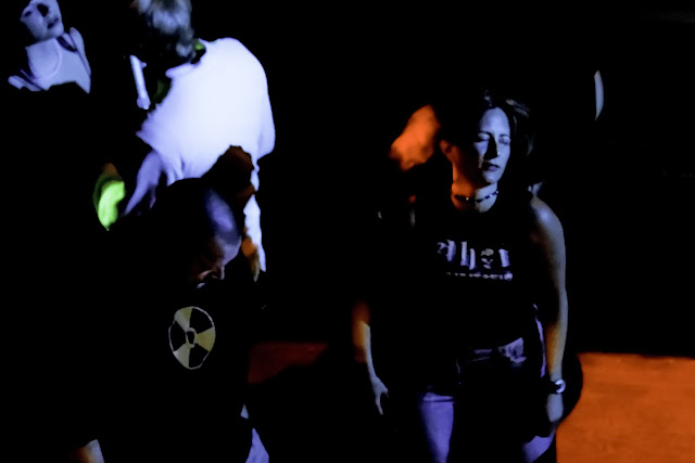
So last night I stepped into a club for the first time in about 6 years. 6 whole years. g-d I feel old. I took baby cam along as I wanted the crop factor to maximise my 70-300 not so good lens. That metal and new indie must have inspired me because I'm actually quite impressed by some of the photos... take a look.
Subscribe to:
Comments (Atom)


