I have received feedback on my second assignment and am including the feedback along with the original assignment in this blog. As part of the feedback it was suggested that I include the original un-manipulated images as the processing of the photo's to mimic Infrared has concealed detail making it difficult to assess whether there are any technical issues which I have to address.
In order for everything to make sense I have included the assignment along with provide my tutor's feedback with the images submitted for the assignment and the original images in black and white but without the infrared processing.
The Art of Photography
Assignment 2: Elements of Design
This assignment focused on graphic elements within a photograph. To accentuate this I decided to, as suggested in the introductory paragraph of the chapter, remove colour from the equation. I did not want to just present a series of monochromatic prints but rather I wanted to use this assignment as an opportunity to try and convey a message, through the specific effects.
We were given a choice of subjects with the restriction that all the photographs are of the same subject matter. I settled on exploring my own subject, Sicily, taking predominantly landscape / architectural types of photographs with the aim of challenging the viewer to see beyond the obvious subject matter.
The aim was to draw on the inherent conflicts within Sicily, a land weighted by an ancient heritage and tradition and yet brimming with modern ideals. This conflict is not immediately apparent on the surface but that message is obvious once one looks beyond the holiday destination to the ingredients within the infrastructure: past, present and looking to the future. I eventually settled on an infrared effect. I do not have an infrared camera so I mimicked the effect in Photoshop (although I did not use the specific infrared filter in Photoshop but rather used various techniques to mimic the effect). I settled on this effect because infrared photography accentuates different tones and highlights in the subject and in turn demands that the message be looked at in a different way too.
The brief was to produce a series of at least 10 photographs
- Single point dominating the composition
- Two points
- Several points in a deliberate shape
- A composition of vertical and horizontal lines
- Diagonals
- Curves
- Distinct even if irregular shapes
- At least two implied triangles
- Rhythm
- Pattern
Single point dominating the composition
 |
| original picture |
 |
| Submitted picture |
The temple at Segesta
Aperture: f4
Shutter speed: 1/640
ISO: 100
Focal length: 67mm on a full frame sensor
Tutor's comments: "Good, if not very original, arrangement of shapes. Parts of the field appear out of focus, is that something to do with the infra red effect?"
My reply: Agreed that it was not a very original composition and that's why I tried to balance the static composition of the temple by framing the landscape to create movement within the picture. The whole aim of this project was to draw the viewer's attention away from the obvious to find the tensions surrounding Sicily within the pictures. The message I want to convey in this picture is that despite longstanding traditions and customs (the temple) which are static and unwavering, life in Sicily is full of movement and energy. As far as the softness is concerned, part of that is because of the infrared effect, I used Gaussian blur and added noise in photoshop, but looking at the standard B&W photo I can See that it is still quite soft. I think in part it's because I was using a zoom lens and took the shot from quite a distance away, focusing solely on the temple. The aperture was wide open and that in of itself was always going to produce a soft foreground.
Two points
Archaeological ruins at Segesta
Aperture: f18
Shutter speed: 1/100
ISO: 800
Focal length: 80 mm on a 1.6x crop sensor (effective focal length: 128mm)
Tutor's comments: "The two columns are well placed but everything is a bit middle distance, some foreground interest would make a difference".
My reply: oh dear, looks like I failed miserably on this one. The two points I was focusing on were the ruins and the burning bush. With the bush being partly framed by the ruins. Whereas I think my tutor has interpreted the shot as the two walls of the ruined house as being the two points.In other words the dynamic of this shot was for the eye to be led to the bush via the ruined structure. Again working on the theme that ultimately while static and unwavering traditions survive, what thrives and prospers is adaptability and resourcefulness. Despite the lack of success, this is still my favourite shot of the series. I look at it and glows with force.
Several points in a deliberate shape
Several points in a deliberate shape
Vineyard and windmills, Provincia di Agrigento
Aperture: f11
Shutter speed: 1/400
ISO: 400
Focal length: 260 mm on a 1.6x crop sensor (effective focal length: 416 mm)
Tutor's comments: "This has got some foreground interest and a lot of foreshortening which gives it an almost abstract, flat look. The sky and windmills are all a bit grey compared to the foreground, as though from a different picture, it might be worth increasing the contrast in the sky area."
My reply:
Agreed but I would add that this is not a composite picture but a single exposure. It was taken from a distance so the zoom has flattened the image.
Agreed but I would add that this is not a composite picture but a single exposure. It was taken from a distance so the zoom has flattened the image.
A combination of vertical and horizontal lines
Aperture: f5
Shutter speed: 1/125
ISO: 100
Focal length: 70 mm on a 1.6x crop sensor (effective focal length: 112mm)
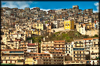
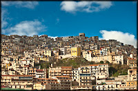
Tutor's comments: "This is interesting. It is divided up well, plenty of depth and everything in focus. Nicely lit."
My reply: This shot clearly demonstrates the different highlights that an infra red photograph brings out in a picture with the original photograph feeling quite flat by comparison. I think this photo really does encourage the viewer to look at a fairly quaint scene and see it in a different way. a sort of "secret garden" right before your eyes.
Diagonals
Capturing the sun (a study of solar panels), Provincia di Agrigento
Aperture: f10
Shutter speed: 1/30
ISO: 100
Focal length: 70 mm on a 1.6x crop sensor (effective focal length: 112mm)
Tutor's Comments: "A very interesting composition, again almost abstract and very well balanced and the curvy road leading the eye in to the diagonals."
My reply: Thank you. I framed it so that the general landscape flowed in the same way as the solar panels.Interestingly after reviewing the photoshop on my pc I noticed the individual rows of panels themselves create perpendicular diagonals to the upward slant of the panels as a whole.
Curves
A29, Trapani
Aperture: f16
Shutter speed: 1/125
ISO: 500
Focal length: 115 mm on a 1.6x crop sensor (effective focal length-184mm)
Tutor's Comments: "Marvellous! An excellent composition. The only slight quibble I would have is that if you had tilted the camera down a little bit the road would have started from the corner of the frame which I think would have been better."
My reply: Thank you!
Distinct, even if irregular, shapes
Criss-Cross, cross my heart
Aperture: f16
Shutter speed: 1/125
ISO: 500
Focal length: 115 mm on a 1.6x crop sensor (effective focal length-184mm)
Tutor's comments: "Another good composition, they are not really irregular though they are fairly regular triangles. I like the little tangle of grass at the front."
My reply: I interpreted the instruction Distinct shapes, even if they are irregular, i.e. they did not have to be irregular. point taken though. Post processing this shot momentarily competed with the pillars for rhythm but I decided that it should remain as my example of distinct shapes.
At least two kinds of implied triangle
Untitled
Aperture: f9
Shutter speed: 1/80
ISO: 100
Focal length: 45mm on a full frame sensor
Tutor's comments: "I like the symmetry and the steps coming down and the figure and the textures. The picture is a bit unresolved at the bottom with his legs being chopped off like that and the ground bleeding off into the border."My reply: I framed this shot to include implied triangles on the steps (3) as well as the photographer (2) including the negative space between his legs. I think the non IR version works better.
Pattern
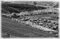
Quilt
Aperture: f11
Shutter speed: 1/25
ISO: 100
Focal length: 300 mm on a 1.6x crop sensor (effective focal length-480 mm)
Tutor's comments: "The long lens helps with the foreshortening to flatten everything and make it into a pattern."
My reply: Not sure I completely understand this feedback. I took the photograph because the arrangement of the field looked like quilt to me. I had wrestled with myself as to which photo I would use because I had taken a few including the following:
Ultimately it was a subjective choice but I felt that of these photographs, the field fitted in and was more in keeping with, the general theme of the work.
Waves
Aperture: f5
Shutter speed: 1/160
ISO: 100
Focal length: 70 mm on a 1.6x crop sensor (effective focal length-112mm)
Tutor's comments: "Very good sense of rhythm. I think a bit more contrast would help, it looks a bit grey."
My reply: Hopefully the unaltered image addresses the contrast and softness issues. again I would stress that film IR photographs tend to be soft and grainy taking away that punchy sort of feel you get with digital photography and which I am quite bored with at the moment.


