Saturday, 30 April 2011

Exercise 7: A Sequence of Compositions

Not sure if this strictly counts as I took this sequence a while back... in August last year but at the time of taking the photographs my thoughts were pretty much the same as the point of this exercise, namely, take the photos as the parade passes and see how many are near misses or if any come up with something worthwhile. Ultimately I think there were 2 or 3 that I have subsequently used with a bit of cropping and editing in CS4. These particular photos I've edited in lightroom and have deliberately used an aged photo setting. they have a greenish/ yellow cast and probably wont be winning any prizes for colour definition, but I i think it works given the sky and the props.

1- Not very interesting and the subject is not striking any interesting pose

2- Better but too much background clutter

3. starting to get interesting

4- oops... flag in the way

5- again, starting to get interesting but nothing out of the ordinary

5- nice shot if only the hand not been cut out

6-nope

7- ok i can work with this one-it conveys the message well


8- again, oops

9-i like this one. the bride is lovely and the lovers behind her convey the intimacy she hopes for


with a bit of cropping this one might work too. pity about the head in the way.

Exercise 6 : Object in different positions in the frame

1-The photograph as I took it without thinking about composition

 A self explanatory exercise:


2- Guitar in the centre of the frame


3- The guitar slightly off centre

4-Guitar on the edge! This is my favourite shot of the 4. it evokes a story... where are the rest of the instruments. the others leave no question as to who is centre stage and whom the story is about. This one, despite the lack of any other instruments makes me wonder where they are, where have they all gone?

exercise 5: Fitting the frame to the subject

As part of this exercise we were asked to examine the different effects  that can be created just by framing the subject in different ways. I attempted to photograph all but the last one from the same spot and because I was using a zoom lens i need to move further out with the final photograph.
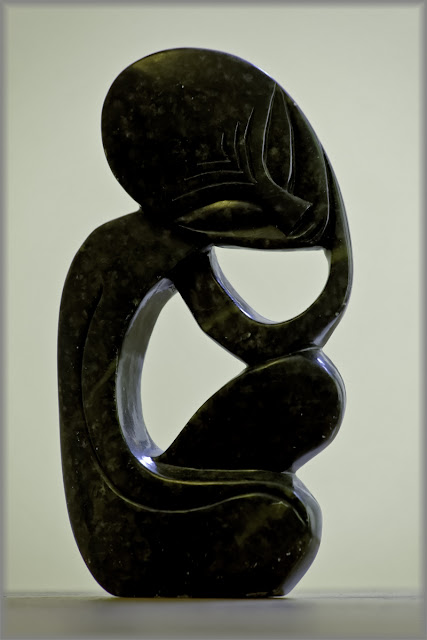

Photo1: frame the entire subject in the photograph


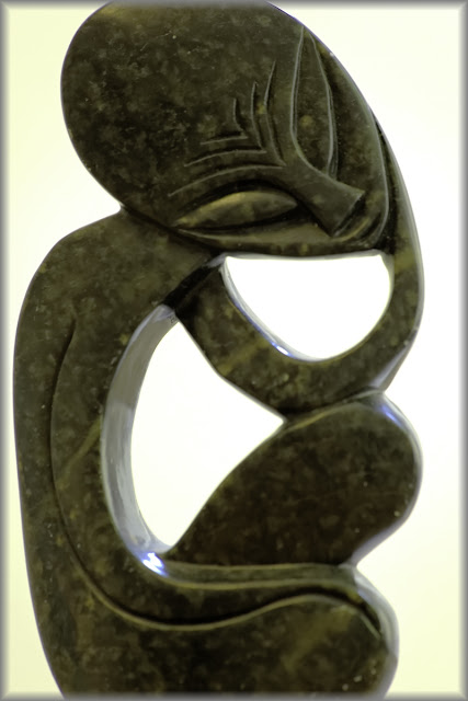
Photo2: frame the entire subject in the photograph with the sides touching the edges of the frame


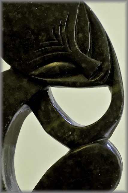
Photo 3 : frame the subject so that only part of it is framed within the photograph


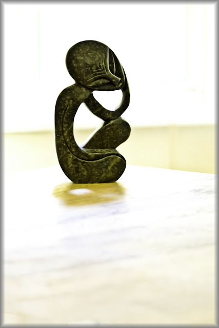
Photo 4: frame the entire subject so that it only takes up a small part of the photograph


For the second part of the exercise we had to examine the effects of framing the photograph in different ways either using L frames or cropping. I chose cropping for the sake of this blog.

Same photograph, different views. I'm not sure I have a preferred perspective but if I had to chose i think it would be the last one which I've tried to frame so that the subject interacts with the viewer. It is not lost in the middle of space, but rather possess the space.




Tuesday, 26 April 2011

Preparing for Assignement 1

Assignment 1: Contrasts

Key notes:
  • wide meaning of contrast
    • brightness
    • graphic- straight lines v curves
    • descriptors of a subject
    • intangibles represented via a visual meaning e.g. tastes/ sensation
    • use  of colour to convey contrasting emotions
  •  I need to think of the assignment when preparing exercises in module so that there is a body of work to draw from when pairing photos to represent the visual contrasts- need to find at least four contrasting pairs
  • Need to make 8 pairs from provided list. I have chosen the following pairs (which will be whittled down to 8 for the assignment):
    1. high/ low: I will try use high and low key photographs to represent this subject. am thinking along the lines of moody atmospheric photographs for low key and very bright almost monotone photograph for the high key
    2. smooth/rough: skin texture will be an excellent medium to represent this
    3. light/heavy: Am trying to avoid the obvious cliche here of feathers and lead, but..... think that the old trick question of what's heavier, a pound of feathers or a pound of lead might not be uninspired
    4. pointed/ blunt: the dish may have run away with the spoon but that spoon was  fickle and soon left with the knife
    5. long/ short: Trying to think of something which represents length, like a long journey, and something which is best able to represent something being cut off and I keep on thinking of Kevin Carter's Pulitzer Prize winning photograph of a starving child trying to make her way to a food camp. This photograph ultimately ended his life too. It is absolutely shocking and not for the squeamish and yet I can't think of anything else at the moment. I will have to come back to this subject later http://iconicphotos.wordpress.com/2009/08/12/vulture-stalking-a-child/
    6. hard/soft: I will try photograph an egg in various stages of "hardship" 
    7. liquid/solid: water and ice and I think I will try and combine the two as my photograph demonstrating the two contrast in one picture
    8. still/ moving: water again.. this time a stagnant pond and a waterfall